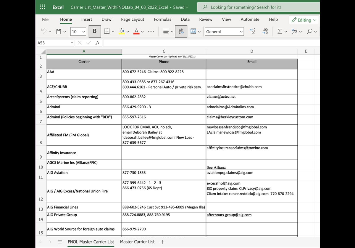
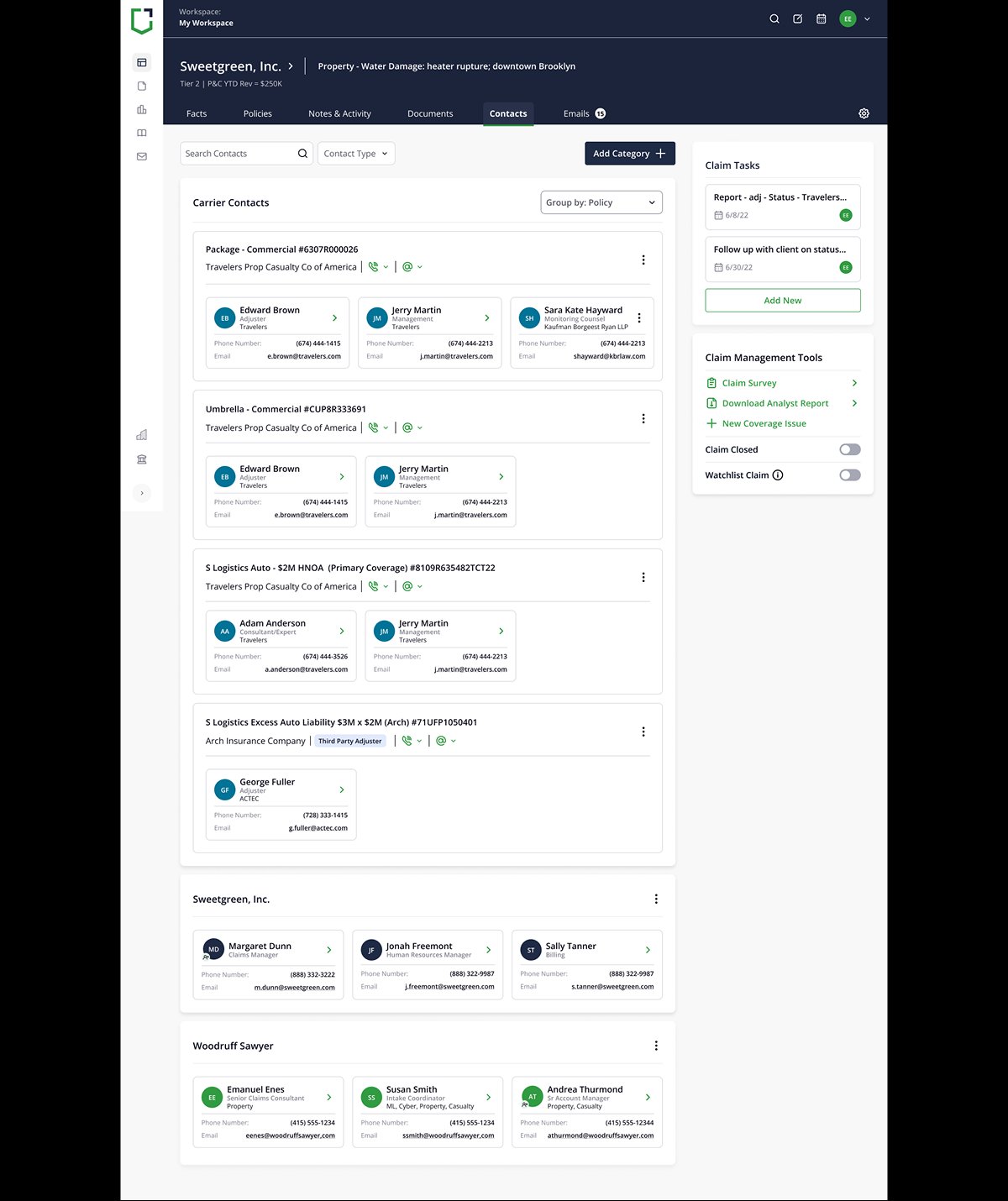
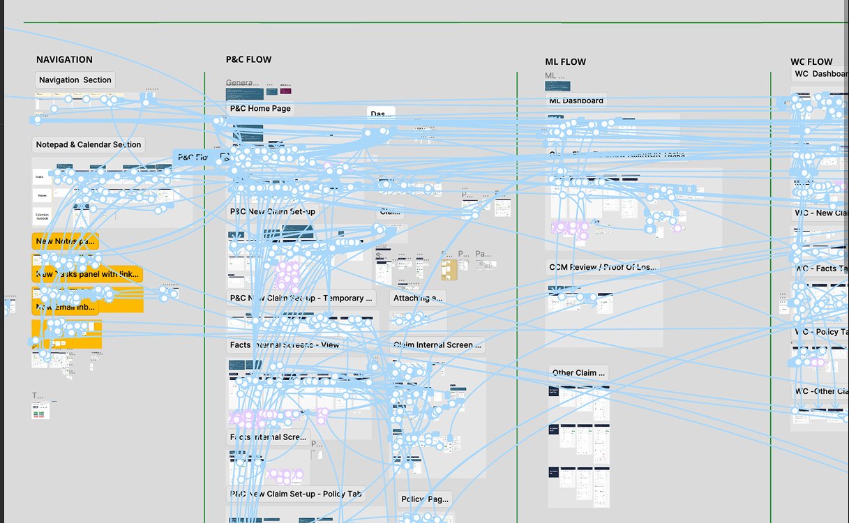
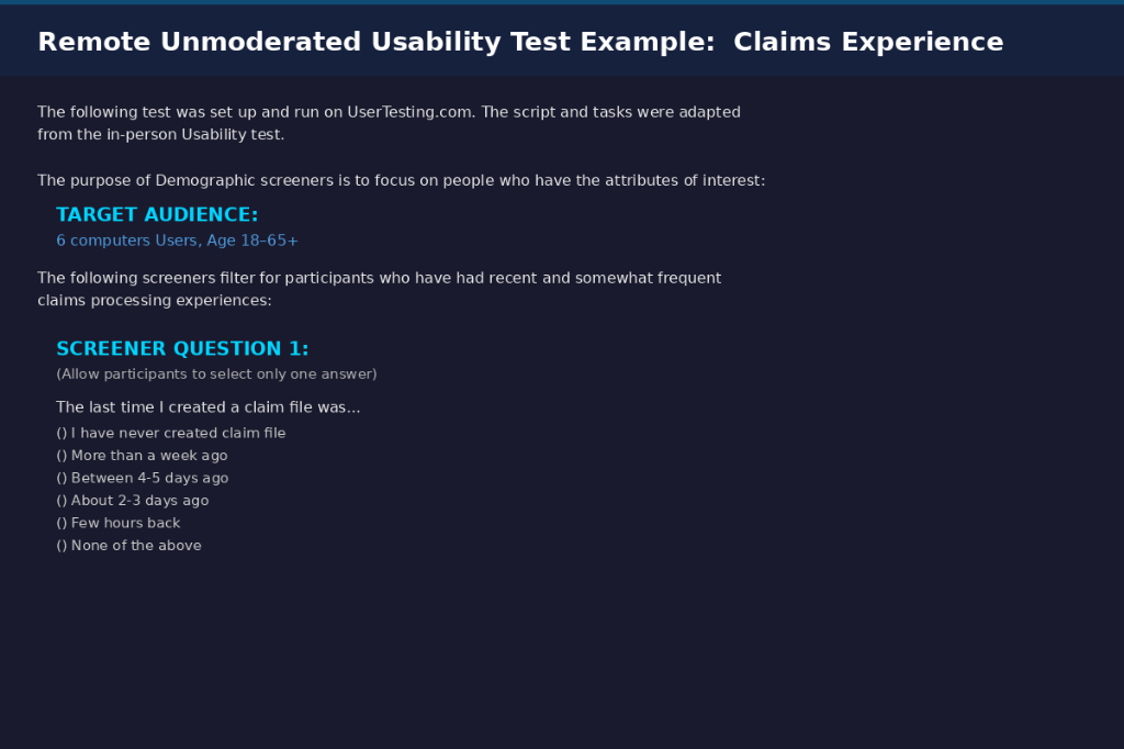
03 — Discover: Understanding Users
Who uses the system,
what they do, and how they do it
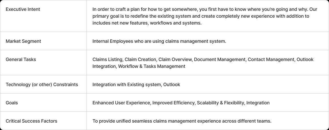
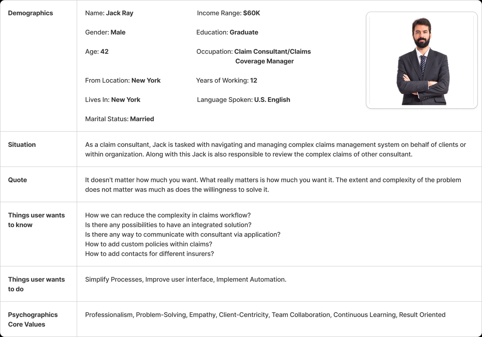
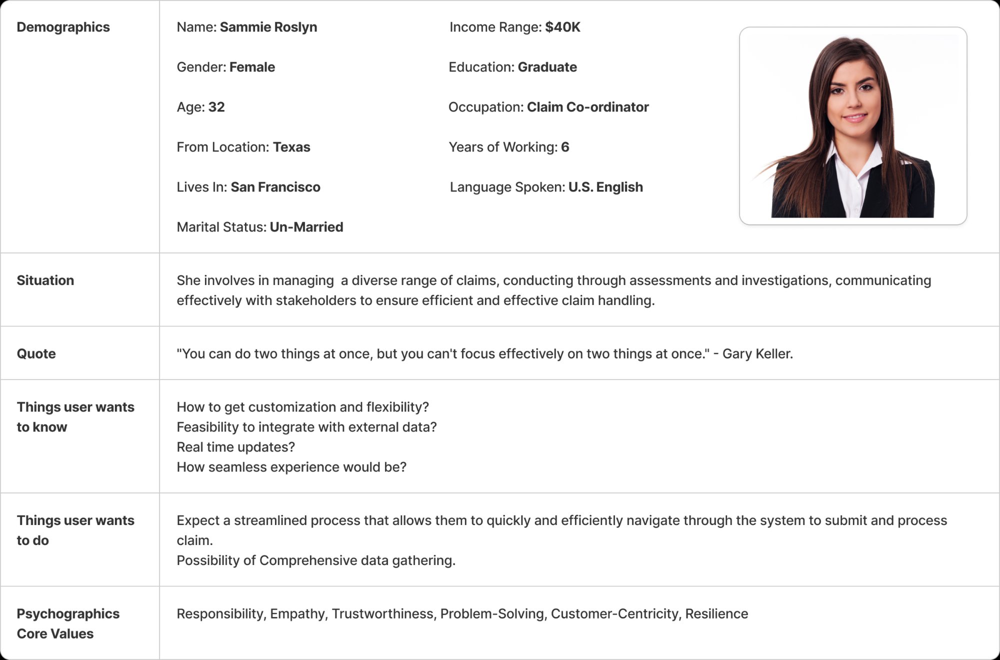
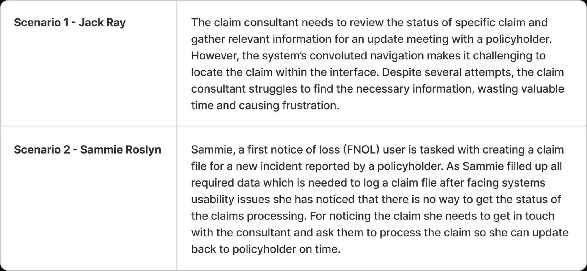
Discovery started by mapping the users before interviewing them — establishing a research foundation that made every subsequent interview question purposeful, not exploratory.
User Profile Matrix — 4 Roles × 6 Characteristics
Strategic Insight
Consultant and Coverage Manager share Expert computer experience and Post Graduate education — yet have fundamentally different primary expectations. This single artefact proved a one-size-fits-all interface would fail both and made role-aware design a non-negotiable requirement from day one.
User Profile Matrix — 4 Roles × 6 Characteristics
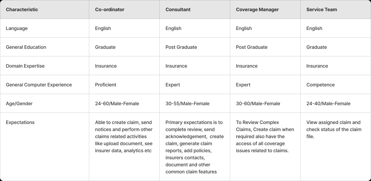
Artifact takeawayPurpose: compare role capability, context, and expectations before designing flows. Finding: Coordinators needed speed and visibility while Coverage Managers needed deeper review control. Decision: role-aware dashboards, access rules, and information density.
🔍 4 roles mapped across language, education, domain expertise, computer experience, age/gender, and expectations. Co-ordinator (Proficient) needs speed and simplicity. Coverage Manager (Expert) needs complex review capability. Divergence confirmed role-aware architecture.
Task Profile — Role × Task Ownership
Tasks mapped against roles before prioritisation to identify shared vs. exclusive workflows. Only Coverage Manager can Review Claims. Service Team has read-only access — simplifying their interface requirements significantly.
Task Profile — Task Prioritization Matrix
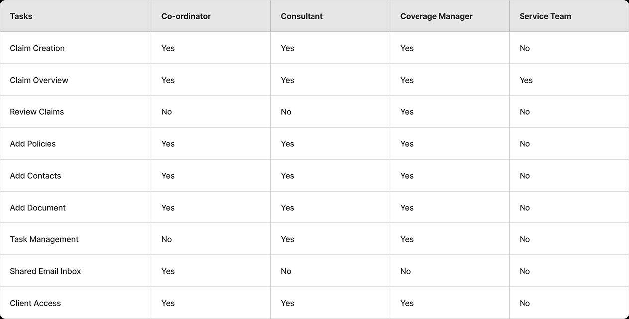
Artifact takeawayPurpose: map task ownership by role. Finding: shared workflows and exclusive responsibilities required different entry points. Decision: keep high-frequency role tasks primary and move low-frequency tasks into secondary panels.
📊 Key finding: Shared Email Inbox is Co-ordinator exclusive — a unique integration need not in the original requirements. Task Management belongs to Consultant + Coverage Manager only — drove the role-aware task panel design.
Task Prioritization — Frequency × Importance
Tasks plotted on Frequency vs. Importance axes. Top-right quadrant tasks became first-level navigation items. Bottom-left tasks moved to secondary menus — directly reducing cognitive load on the primary dashboard.
Task Prioritization Matrix — Frequency × Importance (Miro)
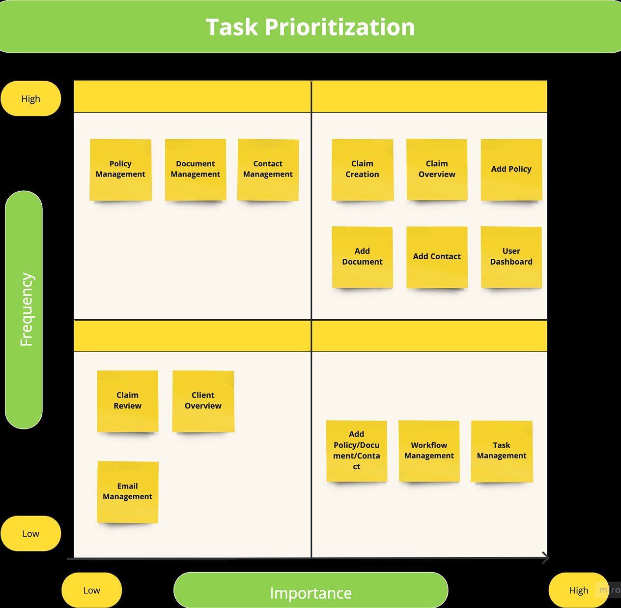
Artifact takeawayPurpose: decide what deserved first-level navigation. Finding: claim creation, overview, documents, contacts, and dashboard tasks were high-frequency/high-importance. Decision: prioritize these flows in the dashboard and claim workspace.
⚡ Priority 1 (High+High): Claim Creation, Claim Overview, Add Document, Add Contact, User Dashboard → all given first-level navigation access. Deprioritised: Workflow Management, Task Management → moved to secondary panel.
User Interview Protocol & Data Gathering
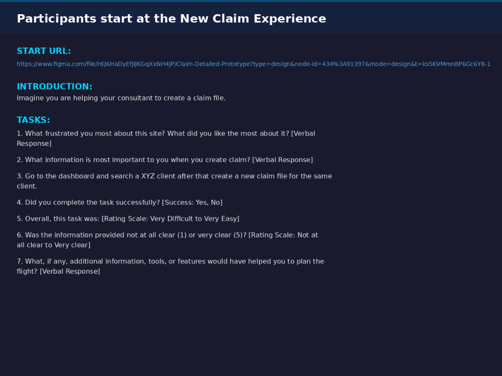
Structured script designed to surface real pain points without leading participants. Sessions run inside the Figma prototype to ground responses in the actual interface. Interview data captured per participant — questions mapped directly to answers for traceability.
User Interview Script — Structured Protocol
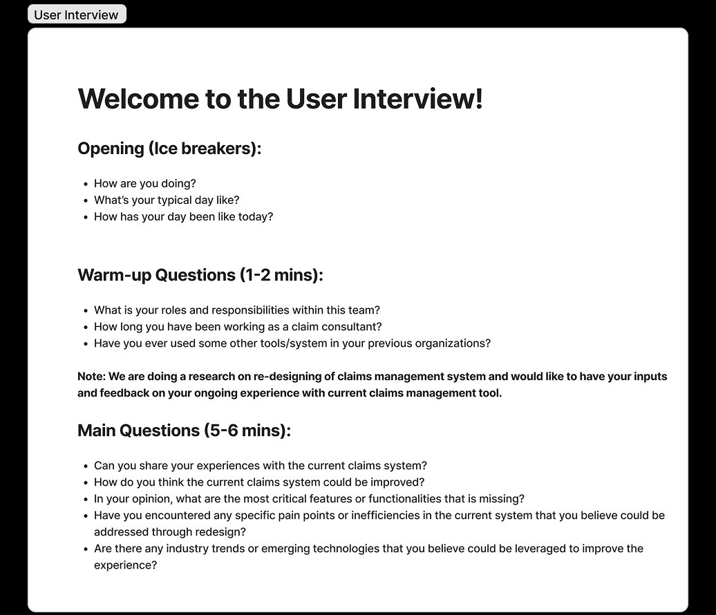
Artifact takeawayPurpose: make interviews comparable and grounded in real claims work. Finding: questions needed to connect pain points to actual interface moments. Decision: use the same protocol to support traceability from research quote to feature decision.
🎙 Structure: Opening (ice-breakers) → warm-up (role + daily responsibilities) → main questions: current system experience, missing features, pain points, emerging technology awareness.
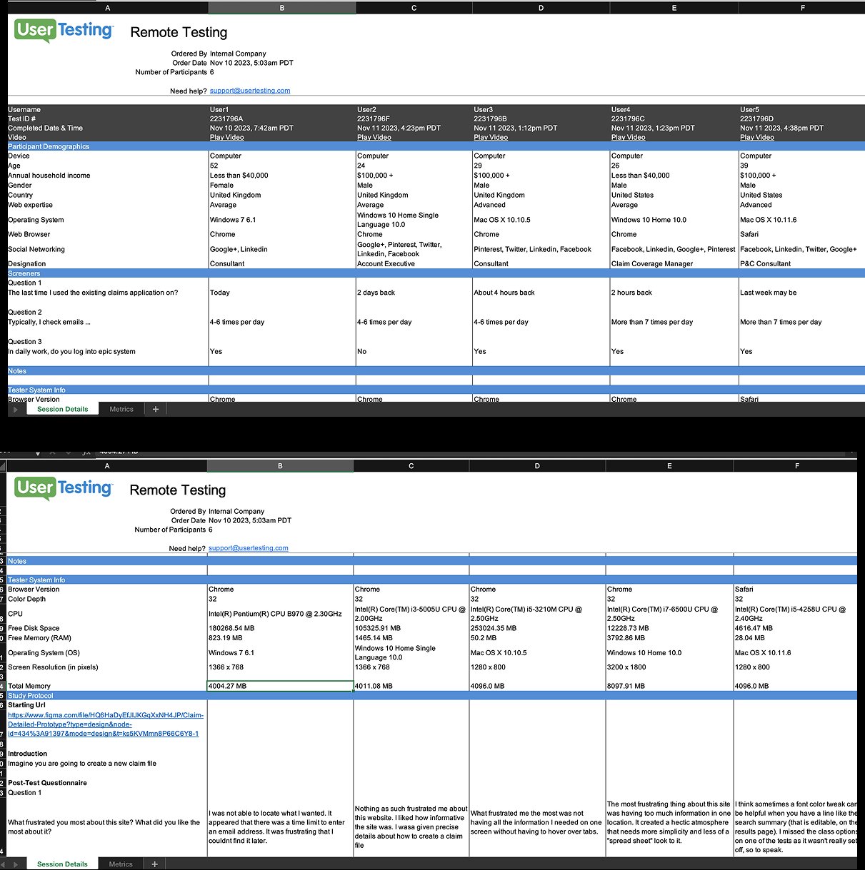
User Interview Data Gathering — Jack Ray Session (July 17 2023)
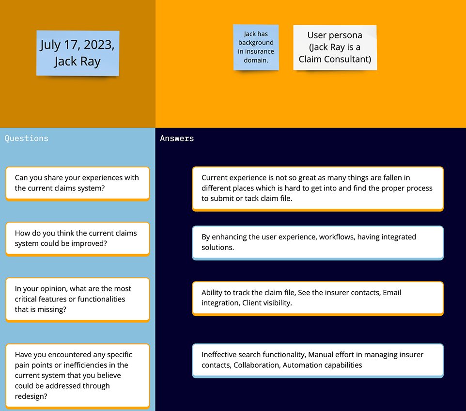
Artifact takeawayPurpose: capture verbatim workflow pain and missing capabilities. Finding: users struggled with search, status tracking, insurer contacts, and email context. Decision: smart search, inline status, contact directory, and Outlook integration moved into scope.
📉 Q: Current experience? A: Many things fallen in different places, hard to find proper process. Q: Critical missing features? A: Ability to track claim file, see insurer contacts, email integration, client visibility. Q: Pain points? A: Ineffective search, manual effort managing contacts, lack of automation capabilities.
Pain Point Synthesis — 7 Clusters
Interview data synthesised into 7 primary clusters. Each cluster became a named design requirement — ensuring no feature was added without a direct research origin.
Pain Points — Struggles and Confusion in Existing Application
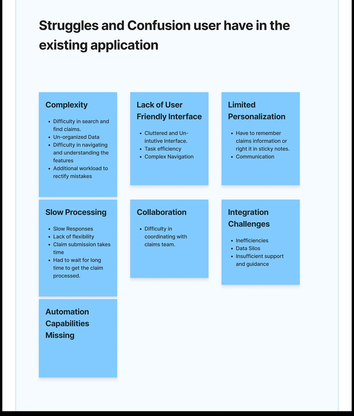
Artifact takeawayPurpose: synthesize raw interview notes into design requirements. Finding: seven pain clusters repeatedly appeared across roles. Decision: convert each cluster into a named requirement before ideation.
⚡ 7 clusters surfaced: Complexity · Lack of User-Friendly Interface · Limited Personalization · Slow Processing · Collaboration Gaps · Integration Challenges · Missing Automation Capabilities. Each maps to at least one specific design decision in the final product.